
Kelvin (K) color temperature is a unit of measurement that describes the color of light and refers to the color of light emitted by a light source, which is very important for chandeliers . The Kelvin scale is the same as the thermodynamic temperature scale, and the concept of color temperature is based on the temperature of a blackbody radiator. A blackbody radiator is an idealized object that absorbs and re-emit all incoming radiation of any wavelength. When such an object is heated, it emits light in a specific spectral distribution depending on its temperature.
Color temperature is expressed as:
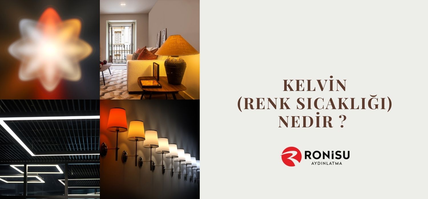
Low color temperature (2000K - 3500K): Light in this range is warm and yellowish. For example, the light seen at sunrise and sunset is in this category. Incandescent bulbs used in indoor lighting usually have this color temperature.
Medium color temperature (3500K - 5000K): Light in this range has more neutral white tones. Fluorescent lamps used in midday outdoor lighting and office lighting are in this range.
High color temperature (5000K - 6500K and above): Light in this range is cool and bluish. Sunlight is close to this color temperature at noon. This type of lighting usually provides a higher sense of energy and alertness, so it is preferred in studio lighting and some work environments.
Kelvin color temperature plays an important role in lighting design and photography, as different color temperatures affect the atmosphere of the environment and the perception of the colors of objects. For example, lower color temperatures create a warm and comfortable atmosphere, while higher color temperatures create a more vibrant and energetic environment.
You May Be Interested In: How Should Suspended Ceiling Lighting Be?

How to Choose Light Color Temperature for Lighting?
The choice of light color temperature should be compatible with the function and atmosphere of the environment in which the lighting will be used. Here are some general guidelines:
Area of Use and Function
Indoor Lighting : Temperatures between 2700K and 4000K are generally preferred for different areas in the home. Warmer tones (2700K-3000K) may be ideal for living rooms and bedrooms, while more neutral tones (3500K-4000K) may be ideal for work areas and kitchens.
Office and Workplace Lighting : Color temperatures between 3500K and 5000K are generally preferred in office environments. Higher temperatures (4500K-5000K) provide a feeling of focus and alertness.
Stores and Commercial Areas : Color temperatures between 3000K and 5000K are generally used in stores and commercial areas. It is important to display products with the right colors and in an impressive manner.
Color Temperature and Atmosphere
Lower (warm) color temperatures (2700K-3000K) create a warm and comfortable atmosphere, while higher (cool) color temperatures (4000K and above) provide a more vibrant and energetic environment.
Choose with the atmosphere in mind: Do you want a relaxing environment or a more business-oriented one?
Light Source and Color Accuracy
When choosing a color temperature, also consider the color accuracy (CRI - Color Rendering Index) of the light source. It is especially important to display accurate colors in places like stores and art galleries.
Energy Efficiency and Longevity
LED lamps with lower color temperatures (e.g. 2700K) generally have higher energy efficiency and longer lifespan.
Ultimately, choosing the right color temperature for lighting should be tailored to the needs and atmosphere of the environment it will be used in. A choice made with functionality, aesthetics, and user comfort in mind can increase overall user satisfaction.
Color Temperature (Kelvin) Selection in Living Spaces
The choice of color temperature in living spaces should be made according to the intended use of that space, its atmosphere and personal preferences. Here are some factors to consider when choosing color temperature for different living spaces:
Living Rooms and Bedrooms
Lower Color Temperatures (2700K - 3000K) : This temperature range creates a warm, relaxing atmosphere for living rooms and bedrooms. Night lamps or lighting fixtures are often preferred in this temperature range because it creates a relaxing and calming effect on people.
Kitchen and Bathroom
Mid-Range Color Temperatures (3000K - 4000K) : A more neutral light tone may be preferred for practical and functional areas such as kitchens and bathrooms. This temperature range can help you see the right colors when preparing food or applying make-up.
Study Rooms and Offices
Higher Color Temperatures (4000K - 5000K) : Cooler tones are often preferred in workspaces and offices because these color temperatures can promote greater alertness and focus. They are ideal for increasing visual contrast and reducing eye strain in these environments.
General Lighting and Halls
Mid-Range Color Temperatures (3000K - 4000K) : Since living rooms are usually the general area of the house, mid-range color temperatures can be preferred here to provide a relaxing and calm atmosphere. This range is suitable for general lighting.
Art Galleries or Special Exhibition Spaces
High Color Temperatures (5000K and above) : Color accuracy is very important in places like art galleries or special exhibition spaces. Higher color temperatures are often used in such spaces to ensure the colors of the artwork are accurately displayed.
The selected color temperature should meet the overall atmosphere of the room and the needs of the users. In addition, other characteristics of the lighting (e.g., illumination level and distribution) should be taken into account. Although the choice of color temperature depends on personal preference, the correct choice is important for the functionality and comfort of specific areas.
Relationship Between Perception and Color Temperature
The relationship between perception and color temperature describes how visual perception and emotional responses are affected by the color temperature of lighting. Color temperature is a unit of measurement that describes the color and tone of light and has several effects on perception:
Emotional Responses and Atmosphere : Color temperature can affect how people feel about a setting. Lower color temperatures (e.g. 2700K-3000K) can create a warm, relaxing, and inviting atmosphere. This type of lighting is often preferred in homes or living rooms because it creates a relaxing and calming effect on people.
Alertness and Attention : Higher color temperatures (e.g. 4000K and above) can feel cooler and more stimulating. This type of lighting is often preferred in offices or reading rooms because it can increase focus and promote a feeling of alertness.
Color Perception : Color temperature can also affect how the colors of objects and the environment are perceived. For example, lower color temperatures can make warm colors appear more distinct and rich, while higher color temperatures can help colors appear more natural and vibrant.
Visual Comfort : Color temperature affects visual comfort. For example, for close-range lighting such as a desk or reading lamp, more neutral or cooler tones (3500K-5000K) can reduce eye strain and may be more suitable for reading or detail work.
For these reasons, it is important to carefully select the color temperature in lighting design. The correct color temperature should be selected by considering the function of the environment, the needs of the users and the purpose of creating the atmosphere.


